

What exactly is CSS linear gradient?
CSS linear gradient function simply produces a smooth progression or transition of different colours in a desired direction and orderliness. It enables you make different colour choice in your CSS background property and not just rely on some bland colours.
Colour gradient is a common trend in UI/UX design. If you have often worried about how to implement such design in your frontend code, that is the main purpose of this article. I intend to make it brief.
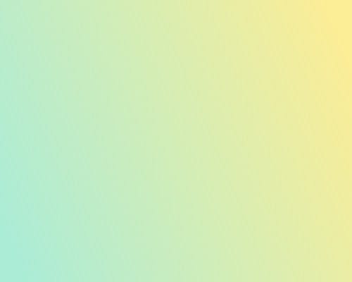
Here is what a css linear gradient looks like
How about we create ours?
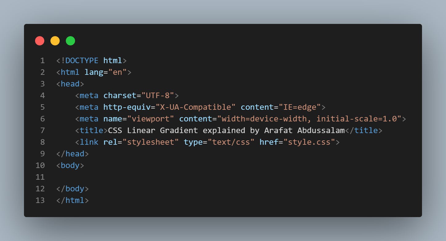
In your HTML file, all you need is to create an HTML boilerplate. Simply type "!" + "↵ Enter key" and link to your CSS file. Remember to save your css file and html file in the same folder. An HTML boilerplate is simply a code template with the necessary tags or elements needed to start an HTML file.
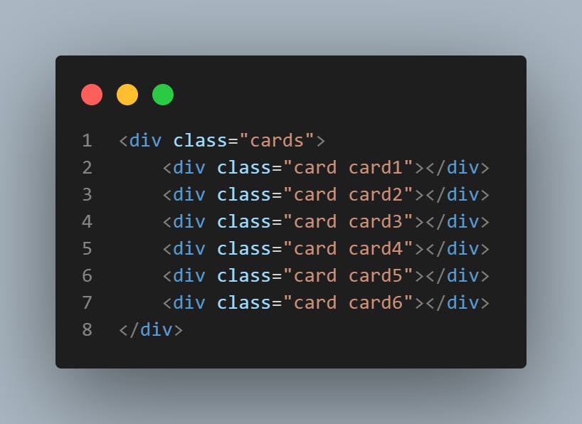
In the <body></body> tag, create a nested <div></div> element like this.
Now, Let's write our CSS code
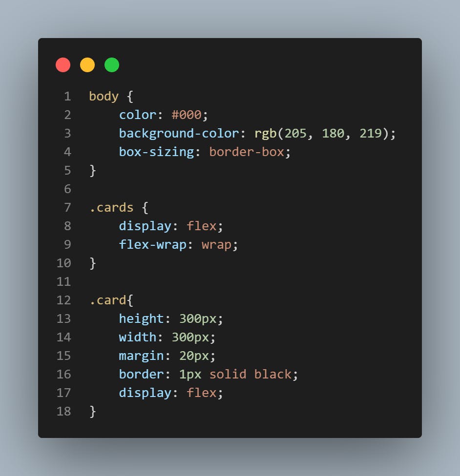
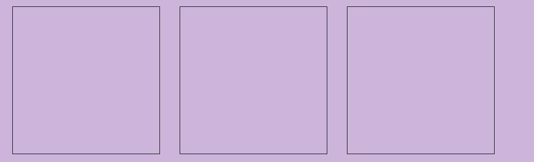
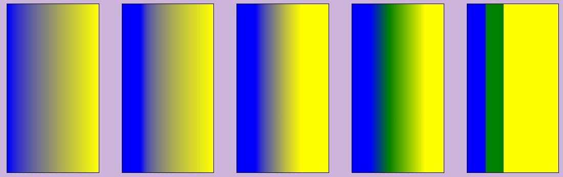
Here is what each of the card looks like
CSS Linear Gradient Syntax
Now, let's jump straight to the main action. CSS Linear gradient follows the syntax rule below
background: linear-gradient(direction, colour start, colour transition1, ...transition2, ...transition3, colour stop). Transition conditionals are usually stated using percentages %. This indicates the beginning or end of the colour transition.
Recall the differences in the class names in each of the <div></div> elements. Hence, to style each card, our background: linear-gradient(.....) attribute goes into .card1, .card2, .card3, .card4, .card5 and .card6.
Colour Direction
The first thing you would want to do is state the direction of your colours - the way you would want your colours arranged.
From bottom to top: 0deg , top to bottom: 180deg , right to left: 90deg , left to right: 270deg.
background: linear-gradient(0deg, red, black);
background: linear-gradient(180deg, red, black);
background: linear-gradient(90deg, red, black);
background: linear-gradient(270deg, red, black);
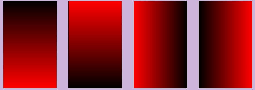
Other methods, asides the use of angle degrees in stating the colour directions include: to left, to right, to top, to bottom, to top right, to top left, to bottom left, to bottom right. Any angle between 0deg and 360deg can also represent the colour direction parameter. This also applies to negative angles such as -60deg, -45deg and so on.
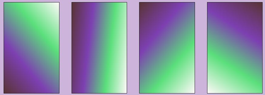
Using other angle degrees
background: linear-gradient(50deg, rgb(88, 52, 52), rgb(125, 63, 177), rgb(90, 223, 123), rgb(255, 249, 249));
background: linear-gradient(97deg, rgb(88, 52, 52), rgb(125, 63, 177), rgb(90, 223, 123), rgb(255, 249, 249));
background: linear-gradient(130deg, rgb(88, 52, 52), rgb(125, 63, 177), rgb(90, 223, 123), rgb(255, 249, 249));
background: linear-gradient(213deg, rgb(88, 52, 52), rgb(125, 63, 177), rgb(90, 223, 123), rgb(255, 249, 249));
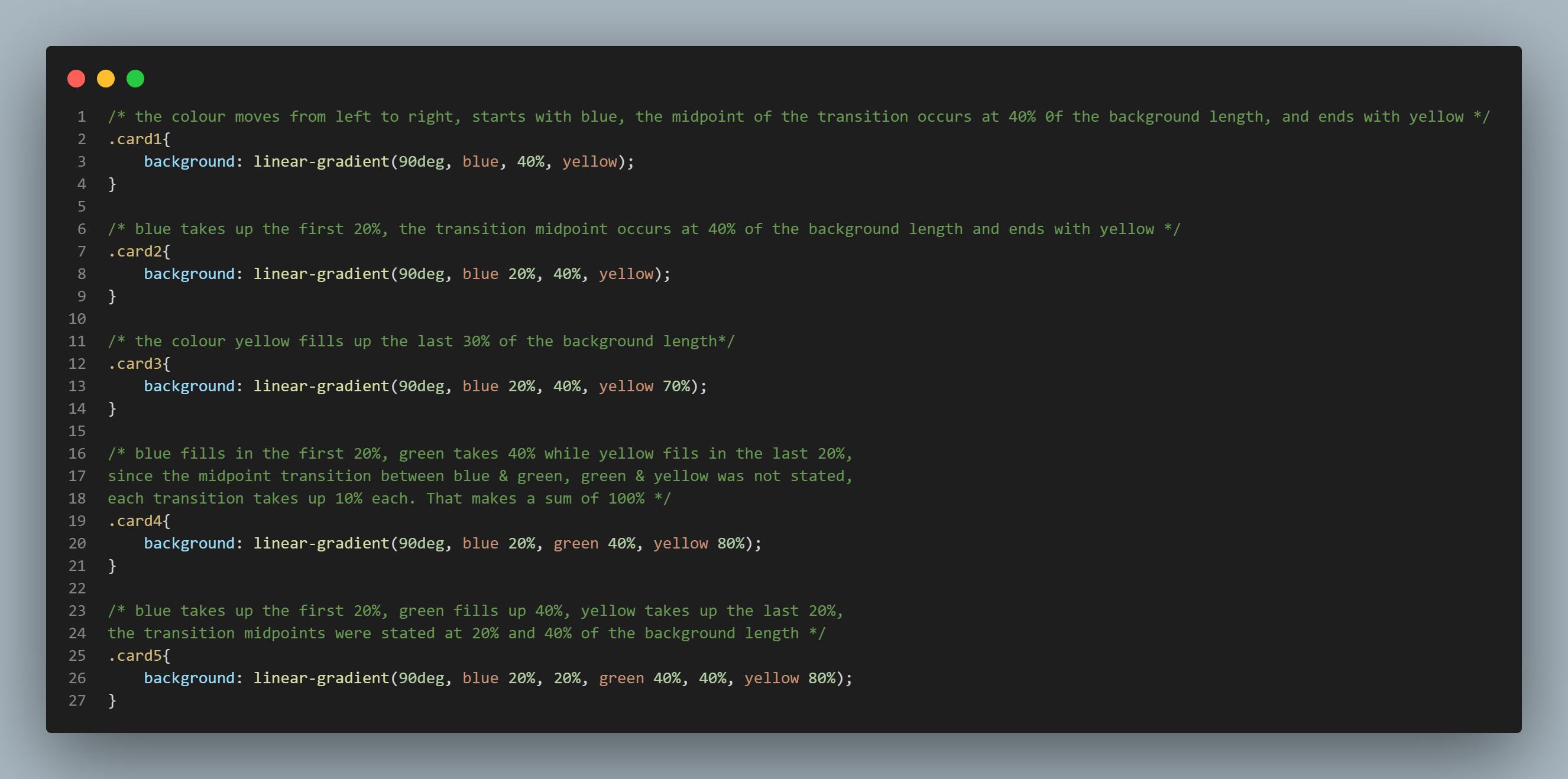
Transition Conditionals
The transition conditionals should be in an orderly manner, moving from the lower percentages to the higher percentages. The code snippet below explains what is happening in each card.
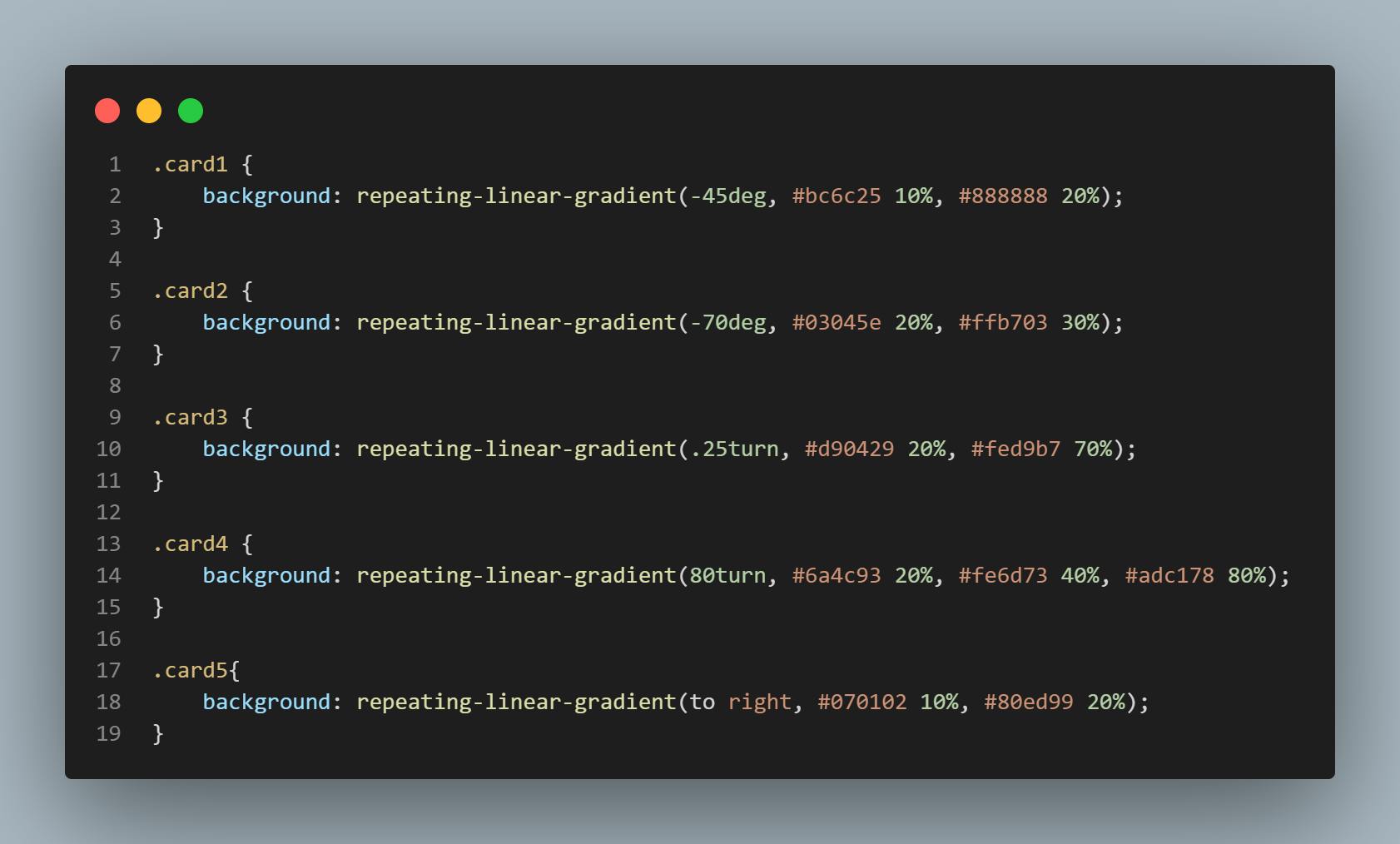
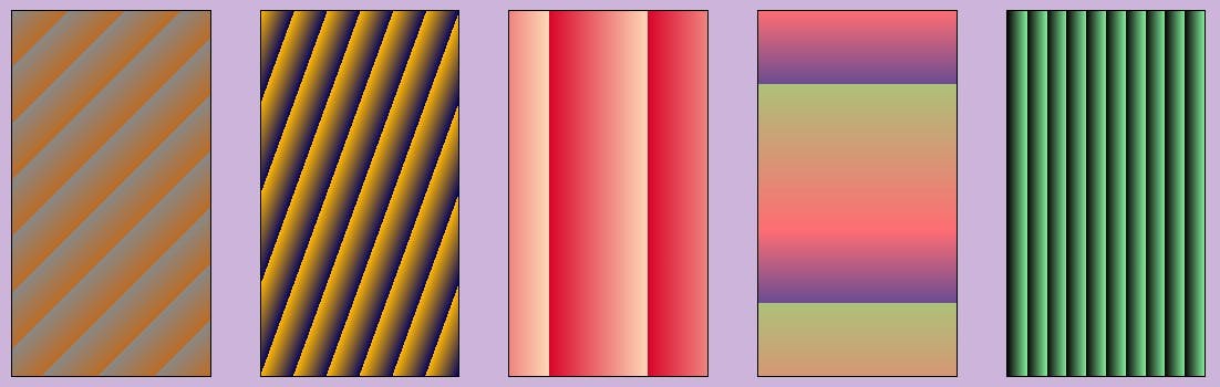
Repeating Linear Gradient
The repeating-linear-gradient(...) function takes in similiar parameters as the linear-gradient(...) function as we have learnt so far in this technical content. This enusures the linear gradients are repeated multiple times until the background image length is completely filled.
Read my previous article here
See you in the next article. Cheers, bye!